Friday, January 22, 2016
"The blood in his veins dried up decades ago. Only dust remains."
The upside of jobhunting is having time to work on portfolio pieces. Here's a quick screengrab of my current WIP: Karl Ruprecht Kroenen, as depicted in the Hellboy movie.
Zmodeler is saving my life. This guy is the first high-detail character I've attempted entirely in Zbrush, including all the straps and buckles and hard-edged details that I used to jump over to Maya to model and refine. I've lost track of the time I've saved by not having to switch back and forth anymore.
As usual I have way too many half-baked ideas at various stages of completion, and I'm constantly resisting the urge to jump around from one to the other. Trying to buckle down and really focus on this guy and get him finished. The plan is to pose him and render him up nice and quick in Zbrush, then move on to the next project in the queue. But maybe at some point I'll build him a low-res mesh and turn him into a game character.
Friday, April 25, 2014
Batmobile Update
Just a minor update on my Batmobile progress. I was hoping to finish this week, but it looks like I'll be spending a couple extra days on it. Most of the smaller details are there, now, with a little work required here and there to tighten things up.
Wednesday, April 16, 2014
KAPOW! BOFF! SOCK!
A quick peek at my current project, still very much in progress:
In addition to being extremely rad, I thought the classic 60's Batmobile would make a good addition to the ol' portfolio. A car is a pretty standard hard-surface practice piece, and the 60's Batmobile in particular offers some interesting challenges in terms of topology. Lots of different surfaces meeting and blending into each other.
The biggest challenge has been working mostly without an accurate reference. I found some top/front/back/side drawings online, but they don't match up exactly with any of the real-life cars. And there's actually several different real-life versions, all with slightly different body shapes and details. That means I have to make some interpretations and adjust some things so that the mesh lines up properly. Which is fun, I get to make the model more my own, but it's also time-consuming.
Monday, March 24, 2014
On to bigger and better things...
Amidst a few distractions, including getting occasionally sidetracked by one of the several other 3D projects I've got on the backburner at the moment, I finally got around to finishing off my Red Saucer model.
Not much changed after my last update, in terms of the modeling. I messed around a little with adding details here and there, but wound up pretty much sticking with what I had - time lost to the hazard of making it up as you go. The work since then consisted almost entirely of playing around with the UVs, textures and materials. My experience is with game assets that mostly consist of one, maybe two, separate textures, and which derive their look almost entirely from the color, specular and normal map. This was a little more elaborate, and involved playing with things like reflections and gloss, and getting mental ray to spit out a nice render.
Materials and rendering aren't my specialty, so the final images could probably be drastically improved if I invested some more time. However, my focus is on modeling, and what I've got is good enough to present the mesh, so I've decided to call it done and move on.
I'm relatively happy with the end result. I think I more or less accomplished the simple, clean, cartoon look I was going for. I also think it stays relatively true to the spirit of the source material, despite the liberties I took with the design.
Thursday, January 16, 2014
Headus UVLayout
Work on the red saucer continues. I'm reaching that point where I've spent so many hours on it that I'm starting to get sick of looking at it, and I'm losing the ability to judge how it's coming along. I have to resist the urge to endlessly tool around, revise bits and pieces, fiddle with details and change things. It is what it is, at this point, and there's nothing to do but press on! So, onward I press.
I've spent the past few days laying out UVs, and on that note I wanted to drop a quick post to recommend Headus UVLayout. Now, I'm no texturing expert. There are probably other great UV tools out there, but this is the one I've become used to, and I gotta say I hardly remember what life was like before it came along. It's super fast and intuitive, and it continues to add amazing time-and sanity-saving features with each update. It's also well worth investing in the "pro" version, rather than the hobbyist, as a lot of the best tricks and tools are limited to that version.
There are a handful of very straightforward, very useful tutorial videos on the site. If you ever lay out UVs and you haven't checked this program out, I highly recommend having a look.
Tuesday, January 7, 2014
"Another day, another mind-boggling adventure!"
I'm trying to branch out, these days, from the low-poly, character-centric, games-oriented modeling I've been doing for almost four years now. My current job search has led me to the conclusion that I need to become much more versatile and well-rounded as a modeler, and to bulk up the ol' demo reel/portfolio in kind.
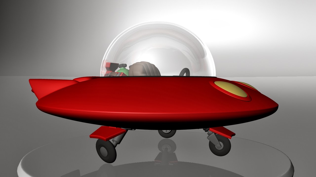
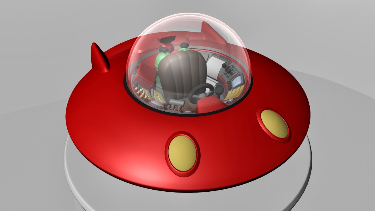
So my current project is a foray into high-poly, hard-surface vehicle modeling. Since I want to complete this in a timely manner, I decided to start relatively simple: my cartoony, stylized interpretation of the intrepid Spaceman Spiff's red saucer. I obviously took some liberties with the design, as the comic strips themselves don't supply much in the way of detail, but I tried to stay true to the simplistic, comic look, with a little retro flair thrown in.
The modeling is basically 99% complete at this stage, and was a lot of fun. Quite a departure from the character stuff I usually do. Normally, the vast majority of my time would be spent in zBrush, sculpting. It's been a refreshing change to work almost entirely in Maya, and to work on more hard-surface, mechanical forms. I've always understood the basic concepts of high-poly, edge-loop modeling, of course, and i'm pretty familiar with Maya's tools, but it's a different beast to actually build an asset from start to finish.
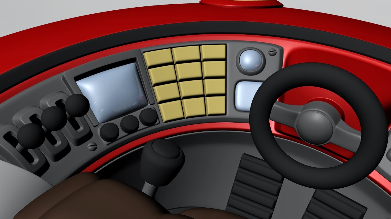
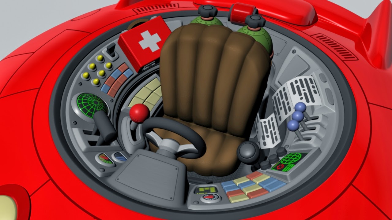
The main challenge I've run up against is the same problem I've always had with high-poly, which is that it can be tough to impart a sense of organic style to something with so many hard edges. It's easy to wind up with an asset that looks stiff, geometric and boring. Especially since, as usual, I'm not working from concept art or a model sheet but basically making it up as I go (a terrible practice that I recommend to no one). It's really hard to tell how a particular detail or shape will fight into the overall look, if you haven't established an overall look! Plus the art of "cartoony", at least to my eye, is knowing where you need more detail for visual interest, and where you need to keep it simple and clean. I spent a lot of time debating adding/removing bolts, hatches, handles, etc.
I'm fairly pleased with how it's turned out, so far. At this point I'm laying out UVs so I can get some actual textures and normal/displacement maps onto the mesh. That will give me a stronger sense of how it's actually going...the dashboard, for example, looks pretty bland, but I think it will take on more of the chaotic, nonsensical character of the comic strip once I've got the screens and buttons and lights all colored and textured. I'm also looking forward to diving into building so real, quality materials. So far it's pretty much all default blinns with the values tweaked. I need to figure out, among other things, a nice glossy look for the ship body, and a proper glass material for the canopy.
Once this is done, maybe I'll need to build a Spaceman Spiff to sit in it...
You can see more images of this project, along with wireframes, on my Carbonmade portfolio.
Friday, October 8, 2010
Psychogeographer, Qu'est-ce Que C'est

Flaneur:someone who wanders the city with the sole purpose of paying attention to it.(Shawn Micallef)
Back in university I took a couple of photography classes. Our final project of the second class was self-directed, meaning we had to come up with a concept, write an artist's statement and execute the project. It was my first attempt at art photography, i.e. something more than a simple portrait, narrative series, or technical exercise.
Choosing my subject matter was easy: I wanted to wander Toronto in the dead of night and take pictures of the city asleep. Empty streets, alleys, pedestrian tunnels. I wanted to do this, at the time, mainly because I thought it made for the most interesting pictures. The city is a chaos of striking visuals. Varied spaces and shapes. Textures: stone and glass, polished metal, crumbling brick, scrawls of graffiti, smooth pavement. Beautiful and strange buildings, interesting nooks and crannies where alleys meet tunnels, and branch off into hidden courtyards between glass-paneled skyscrapers. And it all only gets better at night, lit in all kinds of dramatic/ominous ways by streetlights and shop windows. I'll also admit I've always felt nervous taking pictures of people, especially strangers on the street, never sure if my camera will be an unwelcome intrusion. In this regard as well the city seemed like an ideal subject: it never minds having it's picture taken. It will stand and wait while you dial in that shutter and f-stop.
This idea also appealed to me because the opportunity to maraud around in the dead of night seemed exciting and a little illicit. Boundries get blurry in the city, at night. Everything is kind of closed, or actually closed; some of the places you could normally go during the day are off limits, and some of the places that are off limits are fair game, if only by virtue of the fact that there's no one around to stop you. There's no traffic to keep you off the road, and no other pedestrians to keep you from going in the exit and out the entrance, or strolling casually down walkways designed to usher crowds along at maximum speed. Defying these unwritten and unspoken "rules" of navigating the city can feel liberating. Of course, I'm articulating it now much better than I could then. At the time, these sentiments weren't much more than a vague feeling of adventurousness.
In any case, the project demanded a more artistic justification than "cool pics" any my exploratory inclinations though. I struggled with the "meaning" of my project, something that is still not my strong point. I'm more inclined to make something that looks cool because I like it, than to create something with a message, or purpose. In the end I cobbled together an awkward handful of paragraphs - something about the city bereft of people becoming a kind of landscape. Seeing it in a different way when it's divorced from the obvious functional purposes of it's spaces.
See, I find the city beautiful, and not just the parts that are conventionally attractive. To me, the cracked brick and uneven pavement and broken glass is just as interesting as the sweeping spires of skyscrapers, or carefully groomed parks. Wandering the city at night amplifies this beauty, because there are no pedestrians or traffic to get in the way. The city, separated from the things it is built to functionally accommodate, takes on a life of it's own.
In thinking about what it might mean to develop a much more personal relationship with the city around me, I was straining toward something I couldn't quite articulate because I didn't yet have the vocabulary. However, in the past few months I've learned the word for what I was trying to be: flaneur. The school of thought that informs what I was trying to do: psychogeography.
I learned this from a book I stumbled across totally by accident - Stroll: Psychogeographic Walking Tours of Toronto, by Shawn Micallef. This is the book I have been looking for and never knew it, and it's the basis for a project I have in mind, likely to start once the weather gets bearable outside again. Because it will involve a lot of walking. Luckily, that is what these boots were made for.
More later.
Subscribe to:
Posts (Atom)